
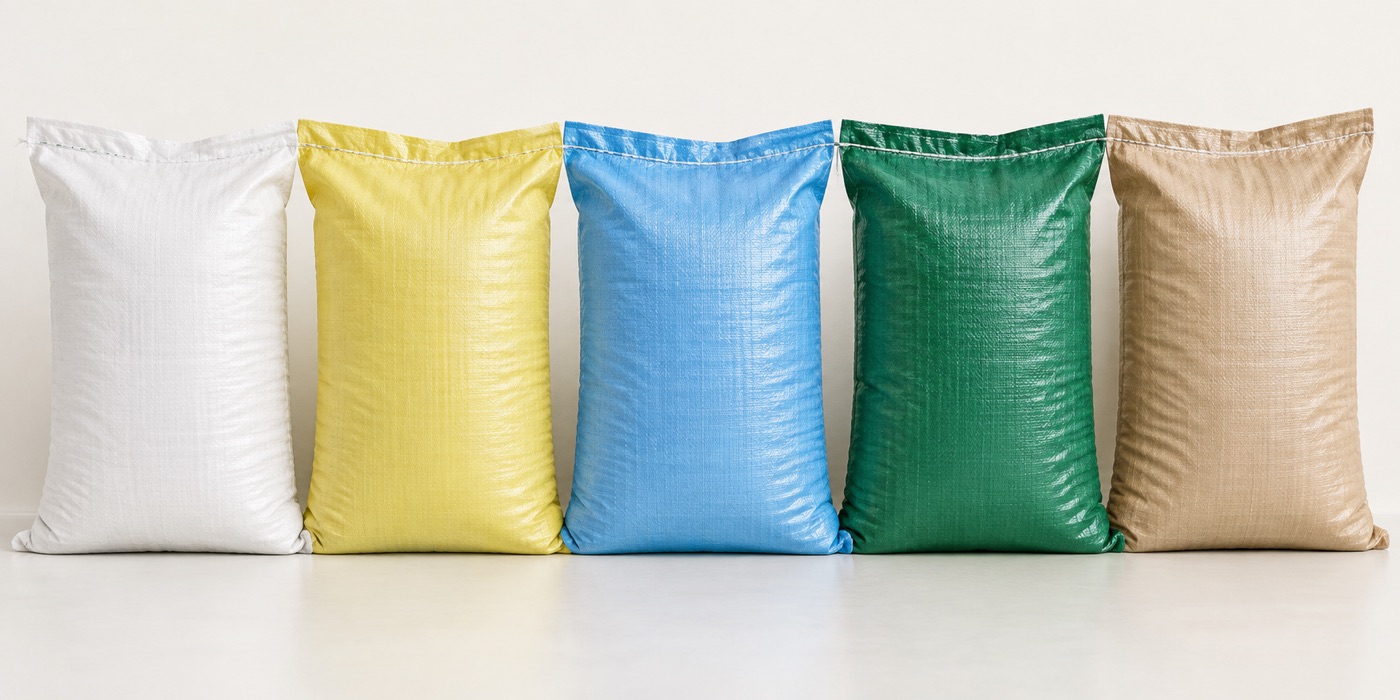
A printed sack has two jobs. It has to carry the product, and it has to still look like it was meant to carry the product when it arrives. The second job is harder than most buyers expect, and it is almost entirely decided before the press starts.
Here is what we have learned from running printed jobs, including the ones that came back.
What the print is actually sitting on
Woven polypropylene is not paper and it is not smooth film. It is a grid of flat plastic tapes interlaced into a fabric, with a visible texture and a sheen that runs one way and not the other.
That texture does three things to your artwork, and none of them are optional.
- Fine lines break up. A hairline rule that looks crisp on a screen will look like a smudge on a 90 gsm weave. Anything under about one point is a waste of ink and a disappointment.
- Thin reverse text fills in. White lettering knocked out of a solid colour block is the single most common print failure we see. Ink spreads slightly into the gaps, and the fine counters inside letters close up.
- Small type crowds. Six point text on a woven bag is legible from thirty centimetres away and unreadable from a metre, which is roughly the distance most people view a filled sack from.
None of that means woven sacks print badly. It means the artwork has to be built for the material rather than scaled down from a brochure.
Flexo or laminated film
There are two processes, they produce very different results, and the choice usually comes down to what is actually on the bag.
Flexographic printing applies ink directly to the woven fabric, one colour per station, in our case up to six colours. It is the economical route and it is what most industrial sacks use. What it does well: solid blocks of colour, bold type, simple marks, logos built from strong shapes. What it struggles with: gradients, photographs, fine detail, and large areas of pale tint.
Laminated film prints your artwork onto a BOPP film that is then bonded to the woven fabric. Print quality is essentially photographic, because the ink is going onto a smooth surface through a different process. What it costs you is money and breathability: the film seals the weave, so the sack stops behaving like a woven sack in terms of moisture movement.
If your artwork contains a photograph of the product and you are not sure which route you need, send us the file. We will tell you honestly whether it prints on flexo. Sometimes it will, with adjustments to the image. Sometimes it flatly will not, and it is much better to hear that before the plates are made.
Choosing colours for a woven surface
Ink on a beige or natural woven fabric is not sitting on a neutral base. The fabric colour shows through, and it changes what the ink looks like once it dries.
- Print on white fabric, or accept the tint the fabric gives you. Natural fabric under a light blue ink reads as a slightly grey blue. If the colour has to be exact, specify white fabric and check the proof on that, not on natural.
- Keep the palette small. Six colours is available, but most of the sacks we print that look genuinely well made use two or three. Each extra station is another chance for registration to drift.
- Avoid wide areas of light tint. A ten per cent tint on a weave is not a smooth wash. It is thousands of tiny dots that read as a dirty patch from any sensible viewing distance.
- Solid dark blocks are the strongest thing you can print. They hold their edges, they read from across a yard, and they hide small registration errors. If you want a sack to look serious, use one.
Light matters more than you think
Approve your proof under the light it will be seen in. A colour that looks right under a cool white office tube reads differently under warm warehouse lighting, and differently again in daylight on a loading dock. If you can, look at the approved proof outside before you sign it off. It takes a minute and it prevents the most common post-delivery argument we have.
Preparing artwork that survives the curve
Your artwork will never sit flat against a wall. It wraps around a full sack, which means it becomes a curved surface viewed from below, at an angle, often in poor light, frequently with another sack half in front of it.
Things we ask designers to do, and the reasons behind each one.
- Keep the important mark in the middle third of the panel. The top and bottom of the face are where the fabric folds and where hands go when the sack is lifted.
- Assume the bottom fifteen centimetres will be obscured. On a pallet, the lower part of a sack faces the sack in front of it. Anything printed there is for the customer's warehouse floor, not for a person.
- Set body text no smaller than eight point. Ten is better. This is a floor, not a target.
- Leave at least three millimetres of unprinted fabric around solid colour blocks. A small registration shift then reads as a design choice rather than a printing error.
- Do not run a hairline exactly along a panel edge. It will drift, and a line that drifts looks worse than no line at all.
- Test the file at fifty per cent size before you send it. If the design stops making sense when it is small, it will not work on a sack.
Sinhala, Tamil and English on one panel
Multilingual panels fail in a very specific way. A designer sets all three scripts in the same typeface at the same size, because that makes the layout look tidier on screen. The result is a panel that reads well in English and badly in the other two.
Sinhala and Tamil are not Latin text. They have different stroke weights, different vertical proportions, and different amounts of visual space around the characters. Set them at the same point size as the English and they will look either cramped or thin, depending on which face you borrowed. Set them in a Latin typeface with the script substituted in, and the mismatch is obvious immediately to anybody who reads the language, which is exactly the audience the panel was for.
What works: a proper Sinhala face and a proper Tamil face, each sized independently from the English, and then the whole panel rebalanced around the three. That takes an extra round of proofing. It is worth the extra round.
One thing we will always push back on. If the panel contains a warning, a dosage instruction, or anything regulatory, have it read by somebody who actually reads the language before you approve the proof. This is the one part of a sack where a bad set genuinely matters to somebody downstream.
Storing printed sacks so the print survives
Print does not fail because of age. It fails because of light, heat and the way the pallets are stacked.
- Sunlight is the enemy. Ultraviolet light fades ink and embrittles the fabric at the same time. A pallet of printed sacks left on a loading dock for three months comes back pale on one side and brittle on the other. Keep them indoors or under an opaque cover, and if you cannot do either, know which face is going to take the sun.
- Heat accelerates everything. A closed container parked in the sun reaches temperatures that soften a hot-melt coating. If your sacks are going straight into a container, load them the day the lorry arrives rather than a week earlier.
- Stack height matters. Very tall stacks compress the bottom layers, and compressed woven fabric creases exactly where the print sits. A crease through a solid colour block is far more visible than a crease through plain fabric.
- Damp blooms ink. Store dry, on pallets, off the floor. This is about the contents first, but it affects print as well.
None of this is exotic. It is the same housekeeping that applies to any plastic packaging. The difference is that woven sacks are often bought in large batches and held for a long time, so the rules get tested harder.
What we check before a printed run is released
For anybody who wants to run the same checks on their side, this is the list we work through before a printed job leaves the building.
- Colour against the approved proof, under the same light source, from the first bag and again at the end of the run.
- Registration across every station, measured rather than eyeballed, because a shift of a millimetre is visible on a hairline and invisible on a block.
- Ink adhesion, checked with a tape pull on a sample from the run. Ink that comes away on the tape will come away in a warehouse.
- Print position relative to the panel edge, checked on a filled sack rather than a flat one. Fabric moves when it is under load.
- Stitch count and seam strength, because print quality does not matter on a sack that opens.
- A retained sample from the run, kept against the next order so that colour drift between batches is something you can see rather than something you have to argue about.
The second and third life of a printed sack
Printed sacks usually get used again for exactly what they carried, and that is fine right up to the point where it is not.
Woven polypropylene is tough enough for several trips, so most buyers get at least two uses out of every bag. Plain sacks get reused freely, because a plain sack makes no claims about what is inside it. Printed sacks are different. A bag that says "Grade A Rice, 50 kg" on the side is making a claim, and a bag reused for something else is making a false one.
Two approaches work in practice. Order a proportion of plain sacks alongside printed ones so reuse for other products has somewhere to go, or print on one face only so the sack can be turned inside out for its second job. What we would not do is specify a printed sack for a product that comes back into your warehouse in the same bag, whatever it is carrying that week.
A checklist before you approve a proof
Eight things to confirm before the plates are made
- Is the smallest text at least eight point, and preferably ten?
- Are reversed-out elements at least 1.5 point thick?
- Is there at least three millimetres of unprinted margin around solid blocks?
- Are Sinhala and Tamil set in proper faces and sized independently from the English?
- Is anything important sitting within fifteen centimetres of the base?
- Have you seen the proof on a filled sack rather than a flat sheet?
- Has somebody who reads the minority-language panel signed it off?
- Have you looked at the colour outside, in daylight, before agreeing it?
If all eight are answered, the run will almost certainly come back looking the way you approved it. In our experience, every printed job that has caused a genuine dispute failed on one of these eight and not on the press.
Where to go from here
If you are planning a printed run and have artwork in any state at all, send it over. Rough files are fine. We would rather look at a rough layout and tell you what will and will not print than receive a finished file that has to be unpicked. Tell us what the sack is for, roughly how many you need, and whether the design is fixed. Everything else we can work out with you.
Tagged
Not sure which of these applies to you?
Describe what you are packing and how it moves, and we will tell you which numbers actually matter for your sack.